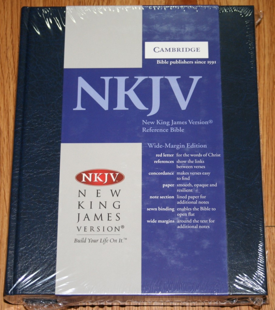
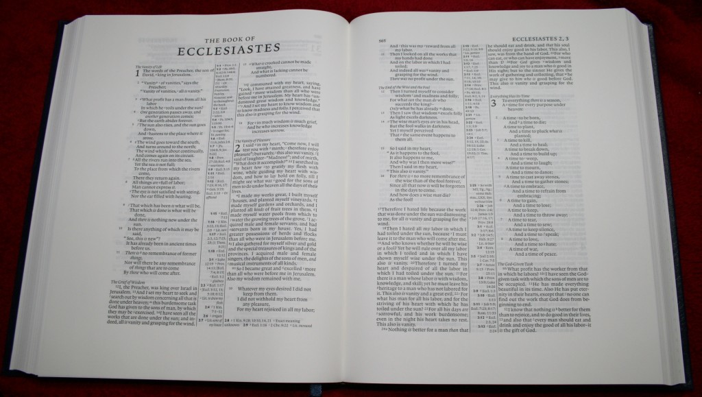
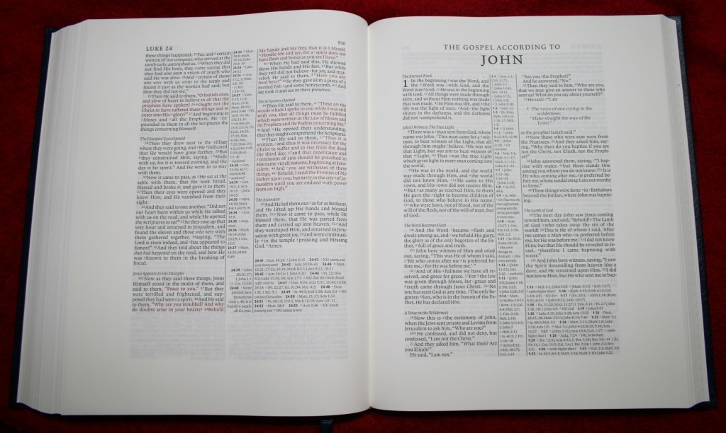
Two attributes that I’ve always appreciated in Bibles are wide-margins and hardcovers. Cambridge University Press has produced one of the nicest Bibles with wide-margins and hardcover that I’ve seen. This model also happens to be in one of my favorite translations- New King James Version (NKJV).
Features of this Cambridge Wide-Margin include:
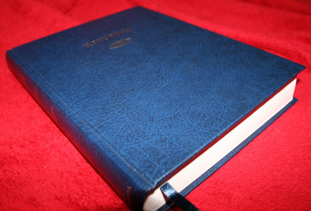
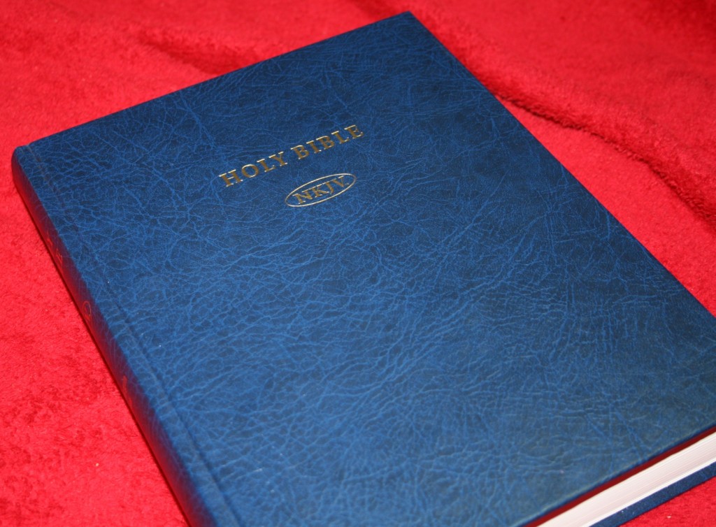
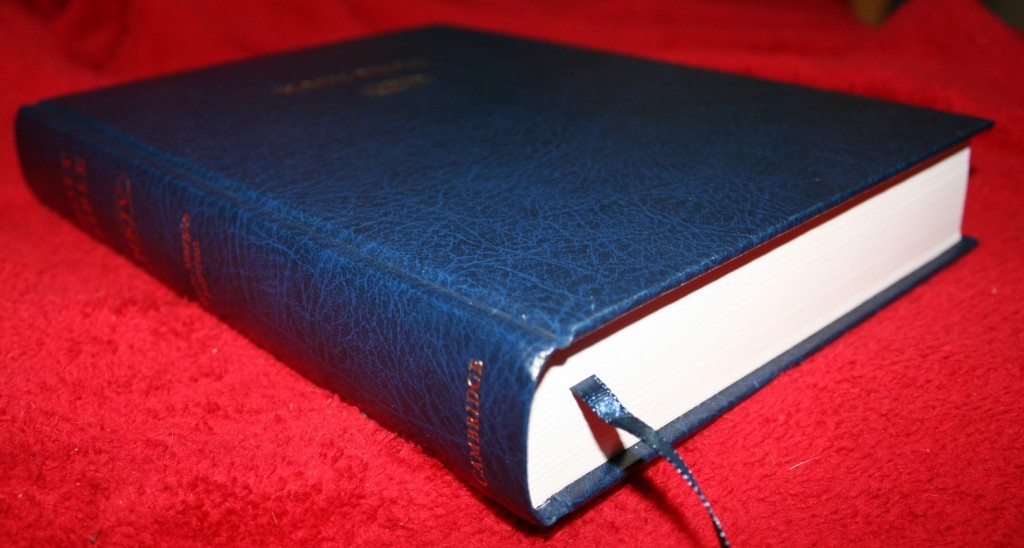
- Blue hardcover
- Sewn binding
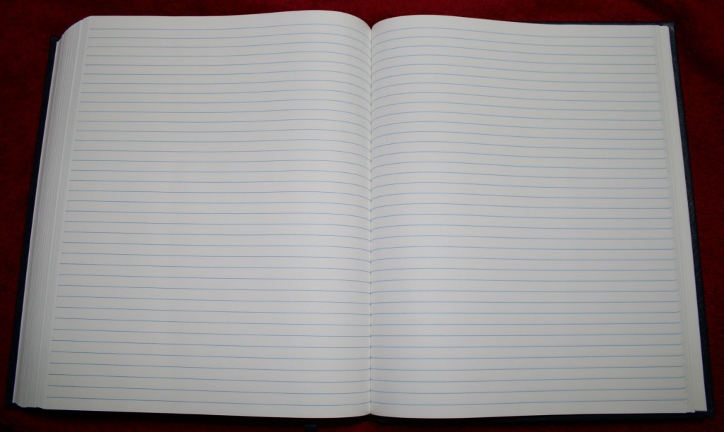
- 56 ruled pages
- 7.9 point font
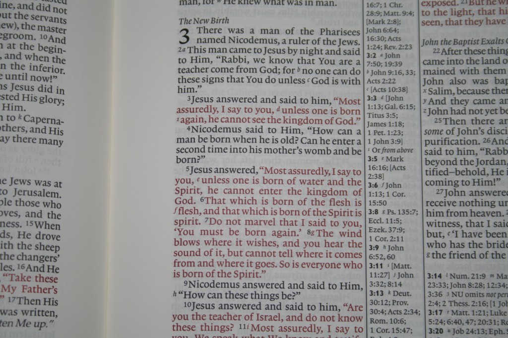
- Red letter
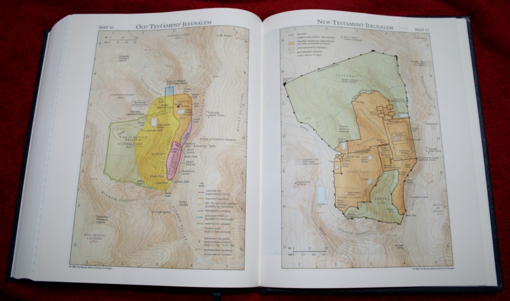
- 15 full color maps
- One ribbon marker
- Size = 7 ¼ x 9 x 1 ½
Version
This edition is in the New King James Version (NKJV). The New King James Version is a modern update to the almost 400 year old (1611-2011) King James Version (my personal favorite). I would say the NKJV is my second favorite, although I use it almost as much as I use the KJV. The NKJV preserves the style of the KJV, while updating the language for modern readers.
I like the features of the NKJV text:
- subject headings,
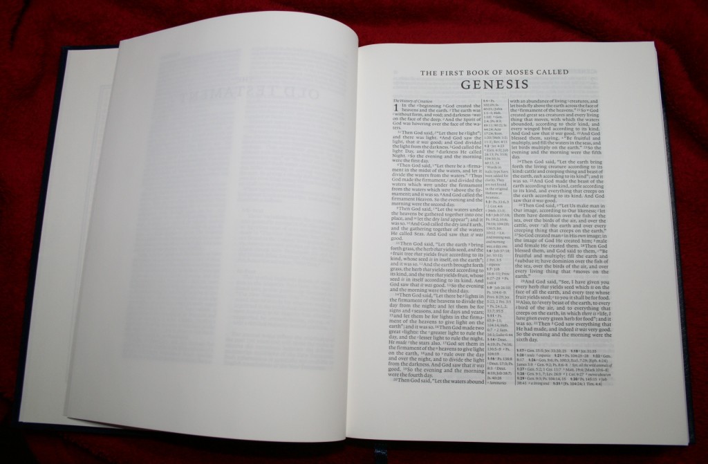
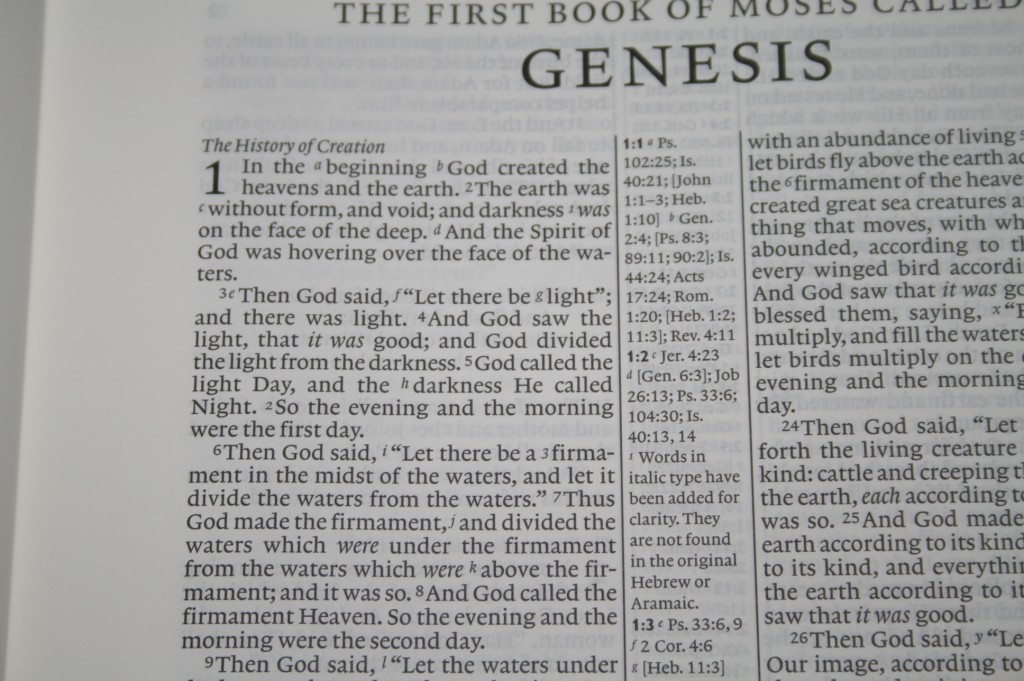
- center column references
- translation notes
- paragraph style
- OT text quotes in the NT in oblique type
- Poetry has an offset type style
Cover
The cover is blue hardcover. It has a grainy texture that I really like. I like hard-cover Bibles because they have excellent quality at a lower cost. In fact, most Bibles I buy are hard-cover. This one is sewn, so it lies flat when opened.
Wide-Margin
This edition has almost 1.5 inch margins on the sides, 1.25 on the bottom, and .875 on top. You lose a little of the margin on the inside due to the spine, but I was still able to get closer to the inside than I expected.
Text
The text is a 7.9-point. I like the typeface, but for me it is a little too crowded. Marking is a little more difficult than I like, but if you use the finest-point Pigma Micron markers for underlining you shouldn’t have any problem. I would be happy with a thicker Bible that has more white-space and have a larger font, but it’s not a deal-breaker. That’s only a slight complaint based on my own personal tastes.
This edition is a nice red-letter. Red-letter is my favorite for reading. It is still easy enough to color-code, but some shades of red might make the text difficult to read. Just don’t color too dark and you should be OK.
I would like to see each book start on the next page rather than just under the book before it (just like my Note-Taker’s). This would leave space at the end of every book, even if it’s just a little space. Every little bit helps.
Paper
The paper is “Bible paper”. It is thicker than India paper and made for writing. It is very opaque, so the text on the other side of the page is faint. When writing with pens such as Pigma Microns there is no bleed-through. Also, the pens and pencils don’t leave marks in the paper (unless you bear down on the paper too hard, then you can get bleed-through and indentions on the page).
One of my favorite features is the 32 pages of ruled paper in the back. There is also an index to your notes. This is a page for every two letters of the alphabet, plus a cover page- giving you 12 more blank pages to write on. That’s 44 pages made for writing notes. I would like to see more Bibles provide note-taking pages in the back.
Concordance
The concordance is 164 pages and seems to have plenty of words for searching. I am impressed with this concordance. It’s much better than most Bibles.
References
This Bible has lots of cross-references. The text for the references is a nice size font. The references are keyed to the text with a lettering system. For example, a verse might have three references, label a, b, and c. In the center column there will be the verse number followed by a, b, and c, with each having the references for that specific portion of the verse. This makes it easier to know which reference goes with which portion of the verse.
Translation Notes
In the center column, along with the references, there are translation notes. These notes explain different renderings. For example, the note for Genesis 1:5 says:
and evening was, and morning was, a day, one.
Notes also show significant variations with New Testament Greek manuscripts. These notes will be marked NU-Text for Nestle-Aland Greek New Testament and the United Bible Societies fourth edition, and M-Text for the Majority Text.
Maps
There are 15 maps on 16 pages. They are really nice.
Ribbons
The hard-cover edition only has one ribbon. It is blue and longer than most ribbons that I’ve seen. The extra length helps when using the ribbon to open the Bible to the page you have marked. It would be nice to have two ribbons in different colors to help differentiate their purpose (one for study, one for reading, etc.).
Preface
The preface to the New King James is included, which explains the translation and format of the NKJV.
Summary
Wide margin Bibles are my favorite choice for study Bibles and this Bible makes for an excellent study Bible. I like the look, feel, and durability of the hard-cover (I always buy hard-cover over leather because of the quality/price ratio). I also like the text itself (though it could be slightly larger). The red-letter is beautiful. The NKJV is excellent for study, reading, and devotions. There is plenty of room for notes. I highly recommend the Cambridge Wide-Margin Hardcover New King James Version Bible.
This free review copy was supplied by Baker Publishing. I was not required to give a positive review- only an honest review.
Click here to buy from Christianbook:
 |
NKJV Wide-Margin Reference Bible–French morocco leather, blackBy Cambridge University Press |
 |
NKJV Wide-Margin Reference Bible–goatskin leather, blackBy Cambridge University Press |
 |
NKJV Wide Margin Reference, Hardcover blueBy Cambridge University Press |
Click here to buy from Amazon:

