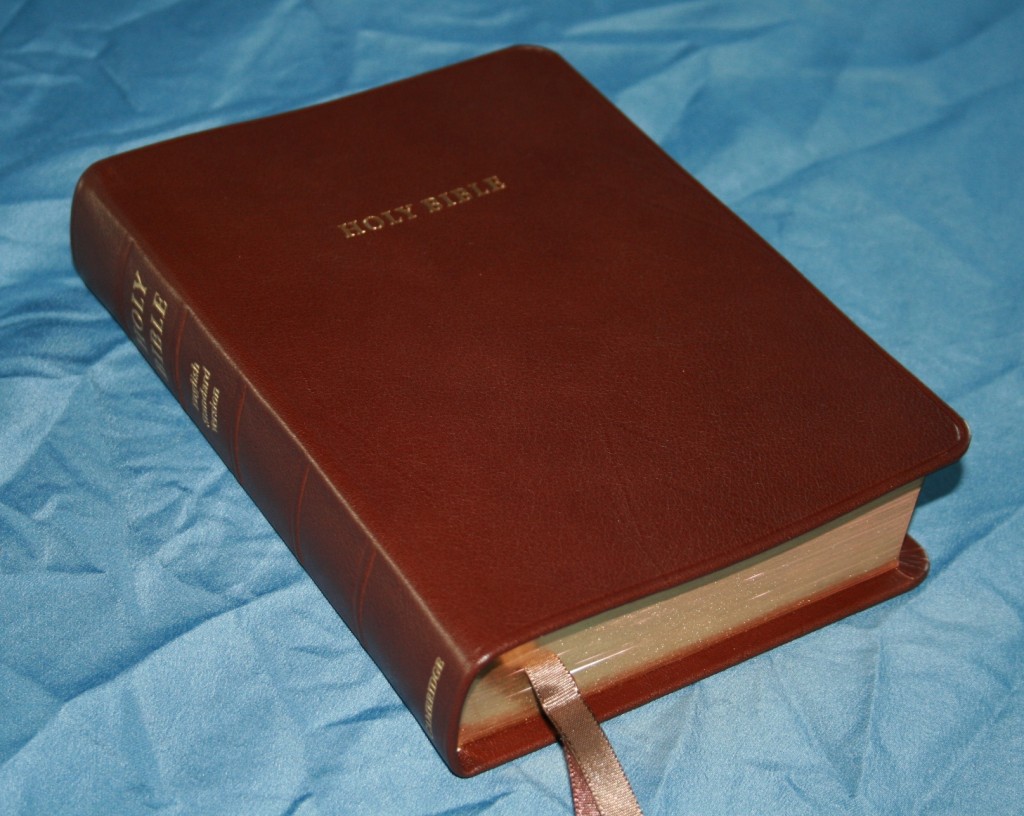
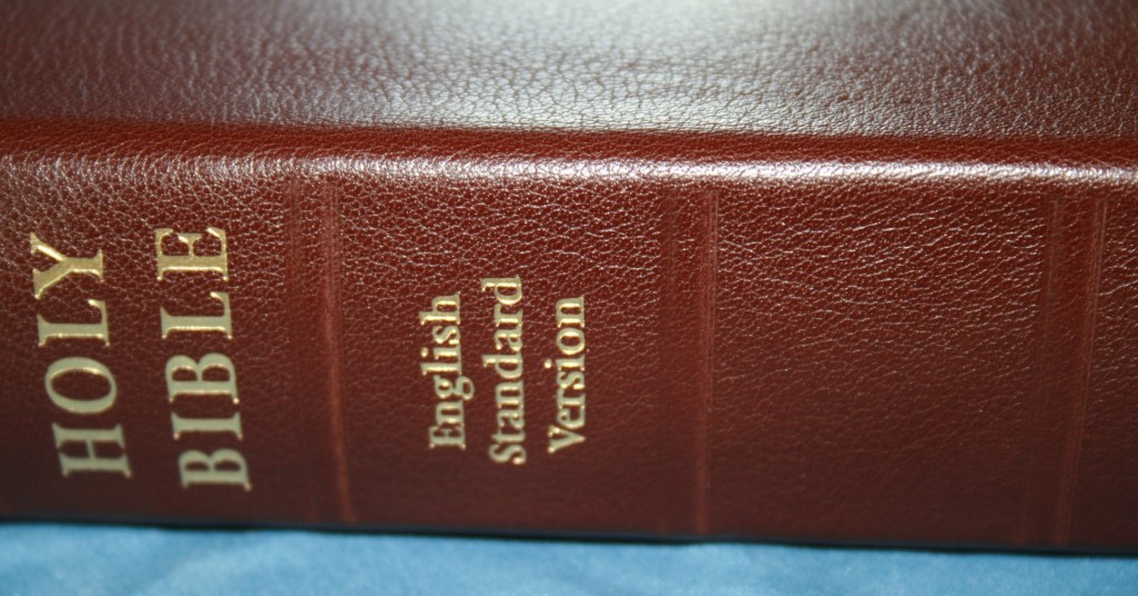
The Clarion is Cambridge’s newest Bible design and is now available in the highly respected English Standard Version (ESV). The ESV Clarion continues the standard layout set by last year’s KJV: it is a hand-sized Bible with a very readable black-letter text in paragraph format, has references located on the outside margin, and is available in a nice range of bindings. Unlike the KJV edition, the ESV Clarion includes headings in the text, OT quotes in verse, and a traditional concordance.
Here are the basic features:
- Preface to the ESV
- 8.75 font
- Black-letter
- Paragraph format
- Extensive cross references on the outside margin
- Section headings
- 2 ribbons
- Concordance
- 15 maps
- Index to maps
- Art-gilt edges
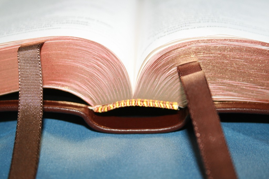
- Sewn binding
- Brown calfskin (also available in black goatskin or calf split)
- 1lb, 11oz
- 7.5 x 5.5 x 1.5 inches
- 2080 pages
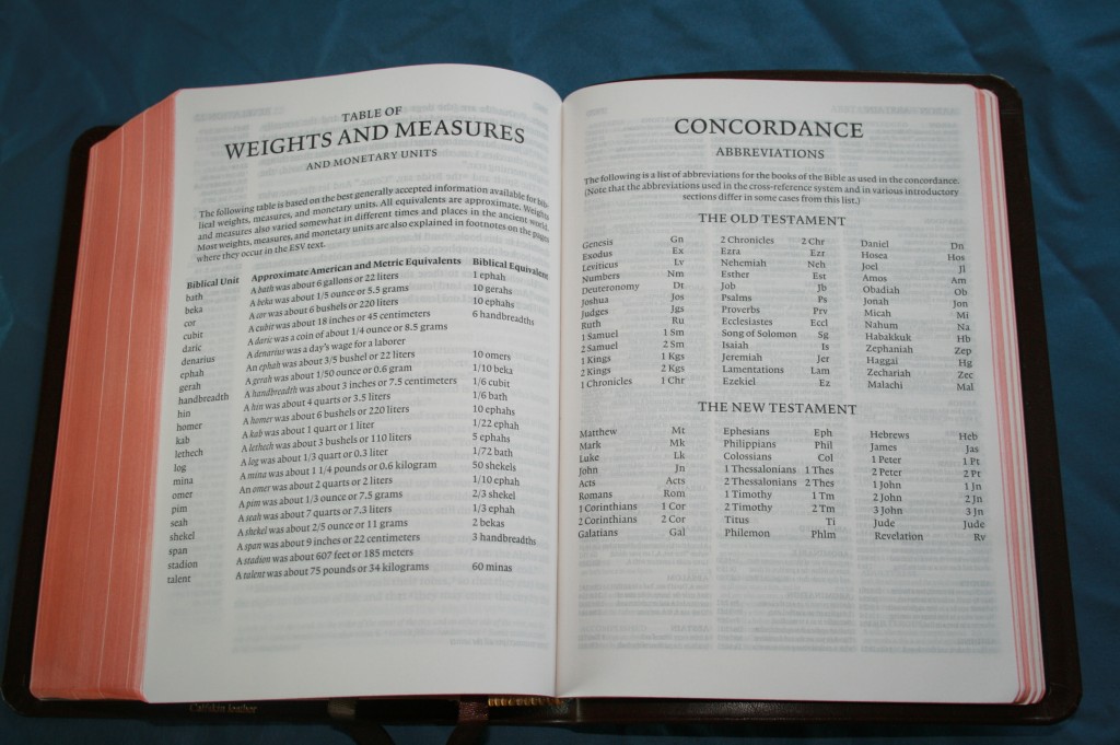
- Table of weights and measures
- $119.95 – $129.95
Binding
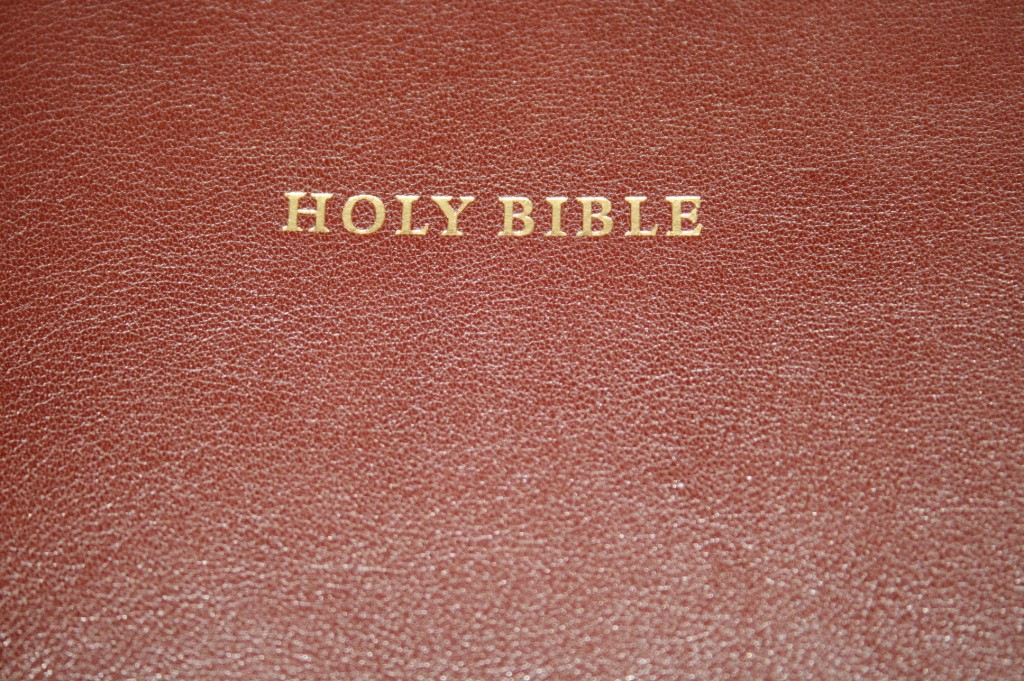
The binding is Smyth sewn, allowing the Bible to lay flat when opened. This edition is calfskin, which is between goatskin and calf split. Calfskin is soft, but stiffer than goatskin. The lining is paper. The cover still has a soft texture. I prefer the cover to be slightly stiff so it lays flatter when I’m holding it in one hand. The Clarion is the perfect size Bible for one-hand use. The grain of the leather is smooth and slightly pebbly.
Text
The translation is the 2011 English Standard Version. It is a very literal translation that is easy to read and highly respected.
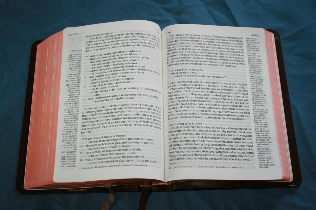
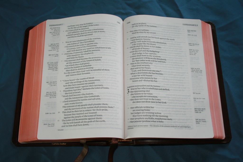
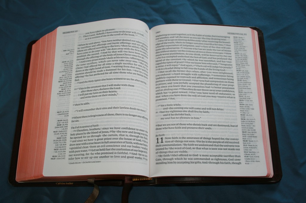
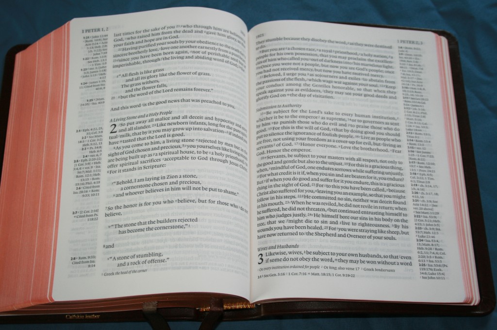
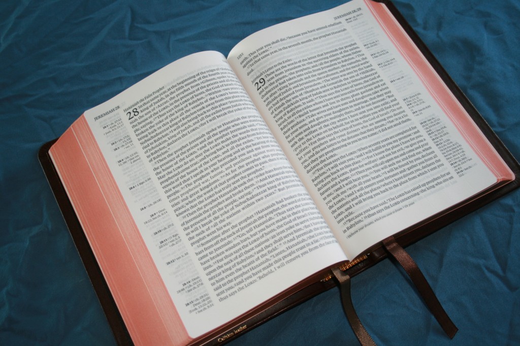
The font is a black-letter 8.75 Lexicon with 10.25 point leading (the space between the lines). It feels large for the size of the Bible. The extra space between the lines gives the text an extra readability. The font is clean and consistently dark. Readability is enhanced by placing the text on the same line as the text on the back side of the page. This keeps the white space between the lines white, making it easier on the eyes.
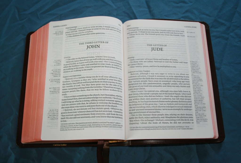
The real gem of the Clarion series is the single-column, paragraph format. The ESV edition has the additional features of headings in the text, OT quotes set in offset text, and poetry set in verse format. This makes the text even more readable. I would like to see the KJV offered with these features.
Section headings also make the text more readable. This helps break up the page into segments, allowing your eyes to see the page in smaller pieces. It also improves readability by summarizing that section of the text. Section heading also helps in scanning a chapter or book for a certain portion of text.
Chapter numbers are printed at the top of the page and include every chapter that is found on that page. Many Bibles only include the first chapter that begins on that page, but that makes it difficult to find a chapter quickly. The Clarion layout makes it easier to find the chapters.
References
References are placed on the outside column and there are plenty of them. There are 18 references for Genesis 1:1. References are keyed with letters. The verse reference is printed in bold. I like this feature because it can be too difficult to find the reference if you only have the letter.
The cross references themselves are the extensive reference system from the RV.
Textual Notes
There are textual notes at the bottom of the page. Textual notes are keyed with numbers. Notes include translation notes, Hebrew and Greek definitions, alternate translations, and explanatory notes.
Paper
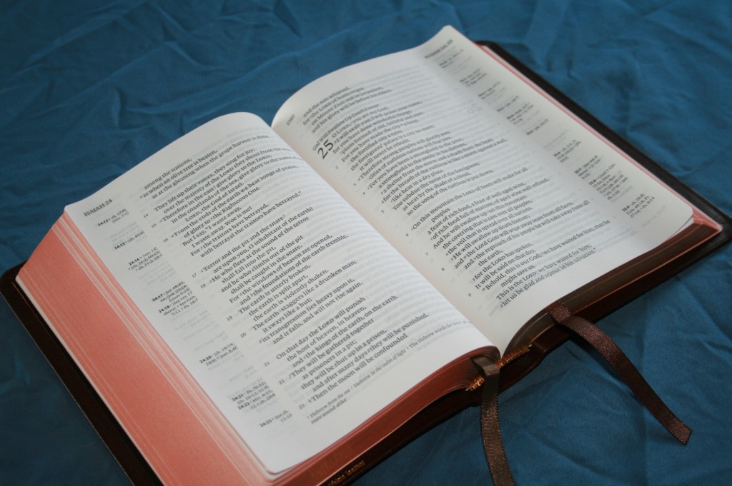
The text is printed on India-paper. The paper is thinner than most Cambridge Bibles (the same as the KJV Clarion) and has slightly more ghosting than other editions, such as the Cameo or the Concord. The weight of the paper keeps the size and weight of the Bible down. For me this is a good trade-off, though many do find the ghosting annoying. For me it is still very readable. The pages tend to curl on the edges due to the thin paper.
Concordance
Unlike the KJV edition, which has a Reader’s Companion, the ESV edition has a traditional concordance. It is 97 pages and is in three-column format. It has lots of entries. I like to look up ‘God’ to see how many entries it has and compare to other concordances. The ESV Clarion has more than most, with 56 entries for ‘God’. There are plenty of entries, making the concordance a useful study tool. Unlike the Cameo and the Concord, each entry is on a new line. This greatly improves searching.
Maps
The maps are the standard Cambridge 16 pages, with an eight page index. They are full-color and are easy to follow.
Ribbons
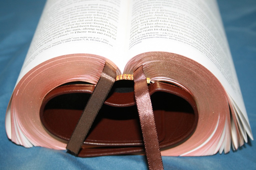
There are two brown ribbons. They are long enough to pull from the corner with no problem. They feel like silk. The material is the same as found in other Cambridge Bibles.
Edges
The edges are art-gilt, also known as red under gold. This is my favorite edging for a Bible. The copper tone looks really nice with the brown cover.
Conclusion
The Cambridge Clarion in ESV is a fine Bible for reading and study. The text and layout look great and the references and concordance make this an excellent study Bible. The paper could be more opaque, but it’s still very readable. It’s the perfect size for carrying and reading. This is my favorite layout and my favorite edition of the ESV. I would like to see this layout become the standard.
Baker Publishing provided this review copy for free. I was not required to give a positive review- only an honest review.

